http://www.soleilnoir.net/
check out this site, really well designed, love how the background changes per slide. really cool. keeps your attention. tho the twitter feed at the bottom could be a good 2pts bigger prehaps or being changed to a sans serif. would make that much easier to read.
great web site tho, with some great typo
Friday, 18 December 2009
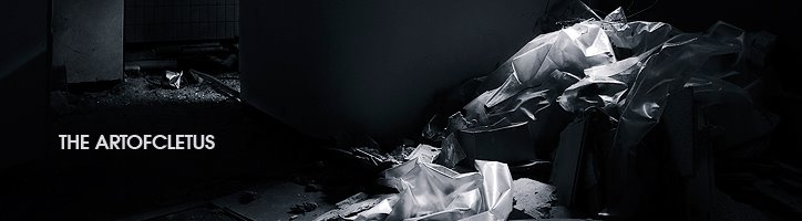
Element Energy Drink
http://www.embraceyourelement.com/
you really have to see this for yourself. an amazing website which takes aggeees to load. but damn is it worth it. the effects and animation is brilliant for each of the elements. the cool thing is tho that some of the actionscript coding in this website i kinda understand!
sounds effects, amazing animation, great coding, cool website. probably a nice drink!
Wednesday, 16 December 2009
Entertain And Evaluate (lifeline) Evaluation
Evaluation: Entertain And Evaluate.
For this brief, I chose to do the “Lifeline” option as i thought it would be most beneficial to the skills i possess. At this moment in time I have a real love for film noir style film and photography. This is the reason I chose to do this brief as I saw potential for this style to be implemented into it. I perhaps went a little off the brief with the medium i chose to do this module as I chose to do a series of photographs to illustrate a youth attempting to commit suicide through overdose because of depression. I tried to use a number of different techniques including different lighting from spot lights, household lights and some neon lights I have. I used different camera techniques using predominantly the aperture priority setting and the Nikon 50mm lens f1.4. This allowed me to use a very shallow depth of field allowing me to capture really atmospheric and moody shots with the backgrounds really blurred and a small area of focus.
The shots I took included close ups, full length shots and quite wide shots especially considering my lens of choice. With doing this method of capturing the theme I was able to create a scene which wasn’t too dark and adult but showed a real sense of purpose and fulfilling the task. I however think that the intended audience of the piece is that of a more adult age who are understanding and maybe going though similar thoughts. I think the way I portrayed the lifeline issue was direct enough to get the motive across.
I did find a location, which was in an abandoned mill in Blackley. I thought this would be idea for a shoot but on second sighting I released it was far too derelict to be even plausible for a shoot there. To provide realism I then decided to shoot in an actual household rather than somewhere dark and abandoned.
I did have some technical difficulties though, especially with the lighting. Trying to capture a moody sense of lighting similar to the film noir style was really difficult. I had difficulty maintaining image quality as the ISO was often hitting over 1000 making the images really noisy. I’m picky when it comes to photography and I love really high image quality so this made selection really difficult. Eventually I managed to take each shot with a good enough ISO reading below 500. This meant I retained as much quality despite lighting conditions being dark for atmosphere. I didn’t want to use my flashgun (Nikon sb-600) as I thought this would create a really fake and bright image when I’m was going for a moody atmospheric look. Sometimes the noise gained in some of these images benefitted the photo despite my disliking to it usually, but the noise sometimes added that bit more drama to the image sequence. After the crit I have decided to try use so different shots which complimented the idea more and seemed more analytical to the type of medicine people would try commit suicide on rather than lemsip sachets and strepsils. I also thought some of the other pill shots I took were a bit too obvious that they were cold and flu tablets or vitamins. One positive aspect which I think really aided the task was my brothers acting. He kindly volunteered to be the suicide victim whilst being ill himself. I think in some of the photos you can really see that he is unwell and I think this aided some of the photographs. He also helped review the photos with me, picking out which he thought were the better ones and commenting on post work I did on the photos themselves. This was really useful to get another person’s view of the images. After the final crit, he went to work in Scotland for the week. This made things so much more difficult to try and get replacement shots for some which were lacking impact or correct compositional value. This being said I had to reassess any option of having another shoot with him. I then checked back though all my files I took from the original shoot to see if there were any other photos which could replace some of the ones initially used. Luckily I had some which could be used and to be honest I think that they definatly looks better than some of the originals I used. I then took everyone’s advice and cropped a lot of the photos so that they are all of the same height and they look a lot more professional now.
I then took my photos into after effects after I had made my triptych image and animated the photos to almost create a slideshow with an atmospheric soundtrack over the top. This could be used on a website, perhaps a TV commercial but using still images to show to devastation that suicidal thoughts can have on people. Along with the dark, slow music it really hits the spot. Almost feels like a NSPCC advert, using the black and white imagery and moody music.
I could have been better with my time management a little bit more. I planned and photographed the shoot in plenty of time and managed to get them all edited and organised all in good time. However in the final week where we were allowed to edit and modify our work I wasn’t able to reshoot certain photographs and edit content to the content I would have liked to as I was stranded in Wales for 4 days. I still managed to re-do some of the work and edit new photos etc but I would have liked a little more time.
Overall despite me wondering off the brief a little bit I would the module enjoyable and found that my photos really worked well with the style of the brief. I struggled a little with the time towards the end but I found that shooting and editing was really enjoyable. I think post production is my strong point when it comes to my photography. I think I captured the essence of the film noir style photography with strong lighting and monotone images. The soundtrack on the final animation made the piece sound like a charity and helpline advert, which is what was intended, so that worked well. My triptych image, I’m proud of.
Tuesday, 15 December 2009
task 2,3,4
Task two:
To promote myself properly, i must ensure i am well advertised with my skills as a designer. I should promote myself in various places and use different mediums to try and sell myself. The bare minimum now i think is to at least have a published website featuring galleries, contact information and showreels etc. Many people now though think that is the only thing they can do to promote and sell themselves however other mediums can definatly benefit us as designers. Ensure oyu have a professional business card can definatly help to ensure you sell yourself and also meeting people/networking at different events and festivals allows you to be able to offer you services via networking at these events. I think these methods are much more effective than for example flyers which people tend to just throw away. However you could advertise in specialist magazines such as computer arts and Digit. Doing this would allow other professionals to see your advertisement and allow you to gain business perhaps by that method. This also means that the advert is seen on a national and sometimes international scale and therefore promoting your skills outside of your local area. This will be very usefull to have effectively communicated ntionally as many of the top design agencies do reside in London for example Psy-Ops, a visual effects company. I think this way of communication via these different mediums will really help promote myself to the most cost effective and beneficial way.
Task3:
I briefly spoke about the ways i would promote myseld in the previous task but i can now exapand on my ideas as to how i would do so cost effectively and which would be the most beneficial for my area of business. Definatly having a professional looking website which is clear, readable and you can view my work on is essential for any company trying to look into me for a job. Ive been looking up hosting and domain names for my company as a freelance artist and photograpgher and have found a really cheap hosting site based in Norway which i think only cost $24 for a year which would be very very cost effective . Business cards are a must, it gives probably the most professional look to the client if you have a well designed, clear business card which states what you do and how to contact you. The only problem is that these cost money to produce and cannot always be of the highest standard. I think Moo-cards.com offers relatively cheap and high quality for business cards. The cards themselves need to be sharp and to the point with contact information and names and what you do. Nothing more is needed as the clients will not want to take the time to read all different techno-babble about what you do and what software you can use. My unique selling point however will be that i can offer a range of services from visual effects to photography. Making me more unique than the people who can only do 1 thing, and that 1 thing only.
Luckily for me i have experience already in the design world as i have published a book titled SlashTHREE: Expressions (The Art of SlashTHREE) which is a design book for the collective i work for. slashTHREE is one of the world’s biggest online digital art collectives and so i have met various people, learnt new things and been given opportunities such as the book to be able to understand the design world more. Since i was young i have used various art related web galleries which are a great way for people to see your work and to network with other people and businesses via collaborations or just talking to fellow artists. Examples are DeviantART, the ever growing Behance Network which I was a member of during the BETA stage and which is now one of the biggest galleries out there, and also the new Artician website which again is a great way to put yourself out there. I think its definatly the best idea to already have an idea of how the business works and so you don’t get lost along the way. These places can help get a foothold into the business but also helps build up a reputation amongst fellow artists.
Task 4:
There are always threats and opposition to your freelance business as it is a dog-eat-dog world when it comes to design. The clients want a quality product for a relatively low price. This being said i think a weakness to having a website is that so many other designers have them. It’s almost mandatory now with the ease of quick cheap internet access and hosting. It’s how you manage your site that will directly help you reel in the clients as opposed to your opposition. Using appropriate feature to make your search engine results the most positive is a big thing when clients are looking to find a designer. They want to see what they are looking for straight away and so with this feature (keywords etc) you can make your result be the top of the list. Thousands of students graduate from design related courses per year and like everyone else are looking to go straight into the design world. So you really have to make yourself unique and standout from the rest of the crowd.
To evaluate, you must understand the business and how it works in order to have a strong foothold into the design world. Having methods of promotion such as business cards, flyers, ads etc are needed to ensure people see your work and know what you are interested in working for them. You must have an appropriate USP to make you different from the norm. You must construct your pitch with consideration of your strengths, weaknesses and the opportunities which may arise.
Tuesday, 8 December 2009
Pixar...Spoof
quality!! despite it being a spoof on the pixar intro it does possess really good effects and 3d animation. nothing more than cool...and it makes you laugh..what more do you want!
Sunday, 6 December 2009
couple of music videos with awesome post production.
sweet effects around the mouths and stuff.dark but awesome. i assume its some sort of rotoscoping.
TOOL ^ wooo the ending of an epic song!
Friday, 4 December 2009
PSDtuts Feature For SlashTHREE Steampunk
http://psd.tutsplus.com/articles/web/best-of-the-web-november-2009/?utm_source=feedburner&utm_medium=feed&utm_campaign=Feed%3A+psdtuts+%28PSDTUTS%29
Another Feature on the ultimate photoshop tutorials website, under the inspiration section.
opportunity to furthermore increase the reputation of the ever growing collective.
great business opportunity for our superb artists
Another Feature on the ultimate photoshop tutorials website, under the inspiration section.
opportunity to furthermore increase the reputation of the ever growing collective.
great business opportunity for our superb artists
Wednesday, 2 December 2009
awesome moleskines and sketchbooks
http://creativeoverflow.net/100-sketchbooks-and-moleskines/
check ^
check ^
Tuesday, 1 December 2009
Bloody Beetroots ft Steve Aoki
for some reason this video is really cool, maybe because of all the slow motion footage and how it interacts with the song itself.
besides tht, the song is ridiculously good :P
Creative Commons Licence.
Overview
Creative Commons licenses are several copyright licenses released on December 16, 2002 by Creative Commons, a U.S. non-profit corporation founded in 2001.
Many of the licenses, notably all the original licenses, grant certain "baseline rights", such as the right to distribute the copyrighted work without changes, at no charge. Some of the newer licenses do not grant these rights.
Creative Commons licenses are currently available in 43 different jurisdictions worldwide, with more than nineteen others under development.Licenses for jurisdictions outside of the United States are under the purview of Creative Commons International.
International Creative Commons.
Creative Commons International, or CCi, is a "port" for Creative Commons Licenses to different copyright legislations around the world. Creative Commons (CC) is a non-profit organization devoted to expanding the range of creative works available for others to build upon legally and to share. The CCi is led by director Catharina Maracke and volunteer teams work in each CCi jurisdictions (in most cases countries or nation states).
really great sumariseations from the Creative Commons UK website!
UK photographer NEW creative rights laws.
First off and foremost, if you currently reside within the UK, there is change coming to © that could severely have a big impact on you and your photography.
the proposed changes to copyright law means that any non commercial entity could use your work on their website without charge or credit!
the government announced on 29 October 2009, to allow free and unhindered reproduction of photographs without payment or credit on non-commercial websites.
This is completely at odds with the Government's stance on file sharing of other forms of intellectual property (films and music) and raises the prospect of crippling thousands of small businesses while protecting large corporate interests.
The proposal uses phrases like "It must be seen to benefit all parties, not some at the expense of others" and yet the Government's proposal does exactly that. It takes the work of photographers who have invested time and money in creating work, and gives it to people who have no relationship with that work, for free.
Photographic businesses are already under severe strain and the proliferation of digital cameras gives the impression that creating professional quality imagery is easy. This will further devalue the work of professional photographers and destroy the photographic industry.
i signed the petition anyway, anyone else who would like to please follow this link.
http://petitions.number10.gov.uk/copyrightreform/
Subscribe to:
Comments (Atom)